January 1st, 2016 • by Kathia Emery • • permalink
Filed In: accessories, antiques, art, color, furnishings, interior design, makeovers, master bedroom, rugs, spacelift, textiles
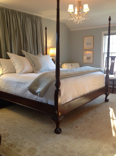
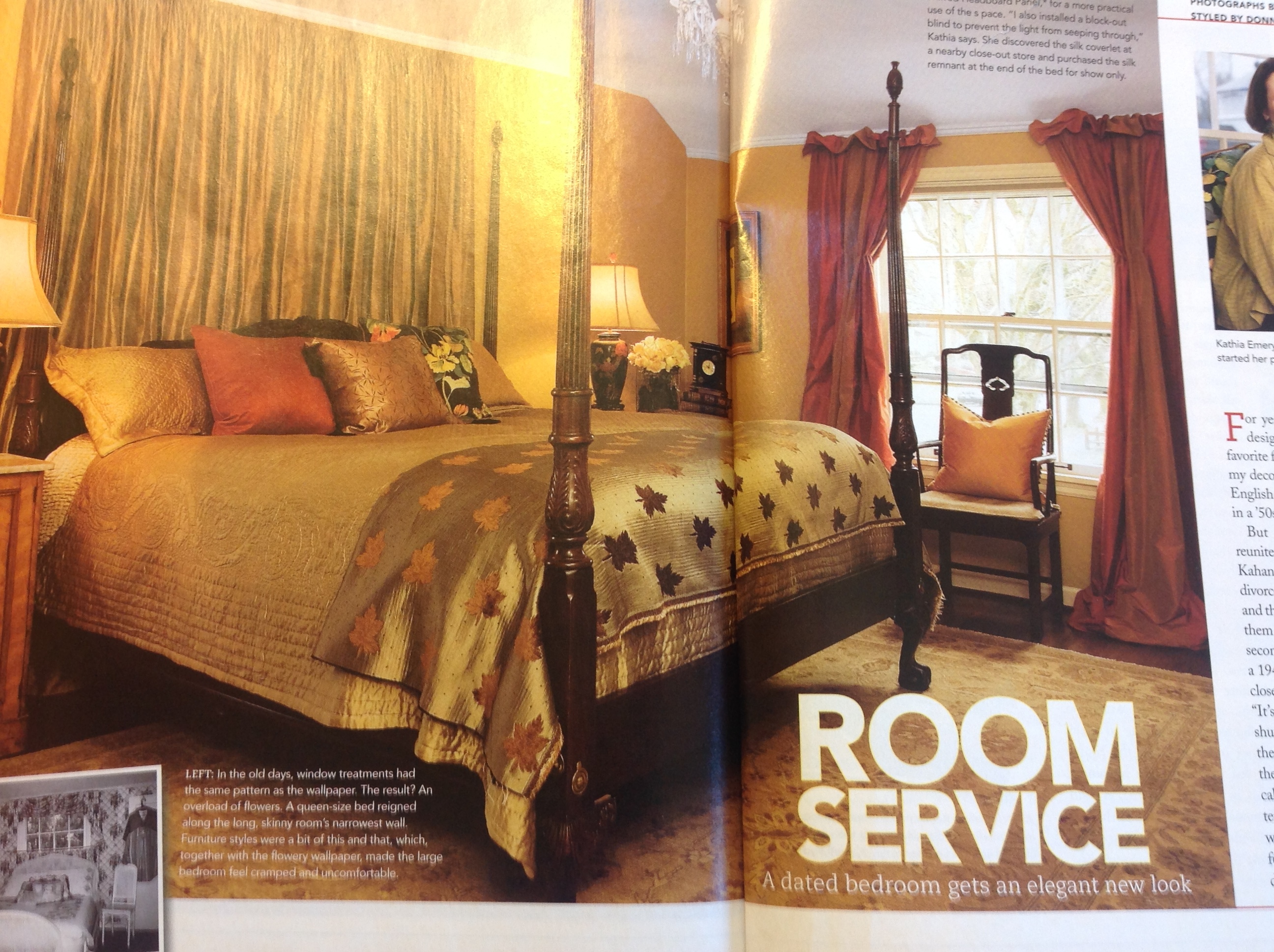
This year we changed up our master bedroom. It went from earthy, Tuscan colors–sage, gold, and red–to spa blue with crisp white linens to echo the white trim, now more prominent than ever with the draperies removed. Never mind that the bedroom in its previous incarnation had been published in a magazine in 2007 (see below).

I was tired of the earthy colors and the silk draperies that I had brought from my previous home, and the room was starting to feel dated. My taste is classic/traditional, but I needed to get the old lady out of the room!
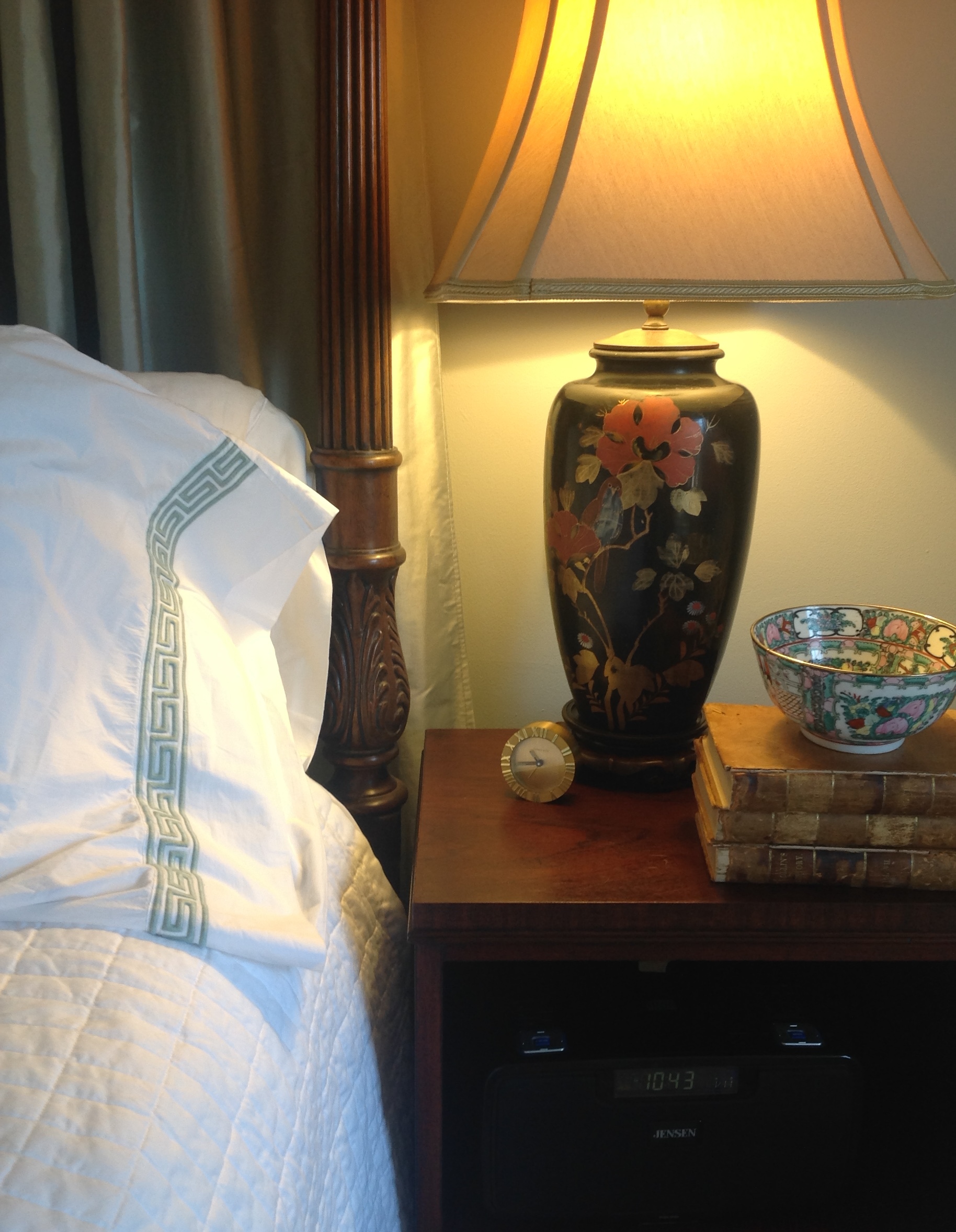
Beginning with the wall color, Benjamin Moore “Tranquility,” we changed the background (and by “we,” I mean my excellent painter, Peter Weller). I found a silk fabric for the back drapery that was almost a perfect match for it. I went shopping for new linens, and stumbled onto a sale at French Quarter (white coverlet, Euro shams, sheets), and picked up the Greek key trimmed pillow shams at Restoration Hardware, along with the spa-colored silk coverlet and Euro sham. The chair in the corner was reupholstered in a Kravet embroidered fabric, which I had Fibre-Sealed. We kept ALL the furniture, the lamps, and the rug, but the room has a completely different mood and feeling. Now, I feel like I’m sleeping in a cloud. 
Over the past 10 years or so a number of clients have asked me to design their master bedroom to look like “a beautiful hotel room.” This baffled me at first, because I rarely came upon a bedroom in a hotel that I liked as much as my own bedroom (well, there was that one in Venice . . .). What I realized was that hotel rooms have something that very few personal bedrooms have: order and simplicity. If your bedroom lacks storage, clutter accumulates. Often it’s the last room in the house that people decide to tackle, so it becomes a catch-all space. Or, you have had the same furnishings since you were 25, and now you are 55 and your taste has changed dramatically. Whatever the reason, give yourself permission to have a beautiful bedroom, and let us know if Emery & Associates can help. We love providing room service.
November 15th, 2015 • by Kathia Emery • • permalink
Filed In: antiques, cabinets, color, countertops, flooring, furnishings, marble, master bathroom, master bedroom, new construction, stone, tile

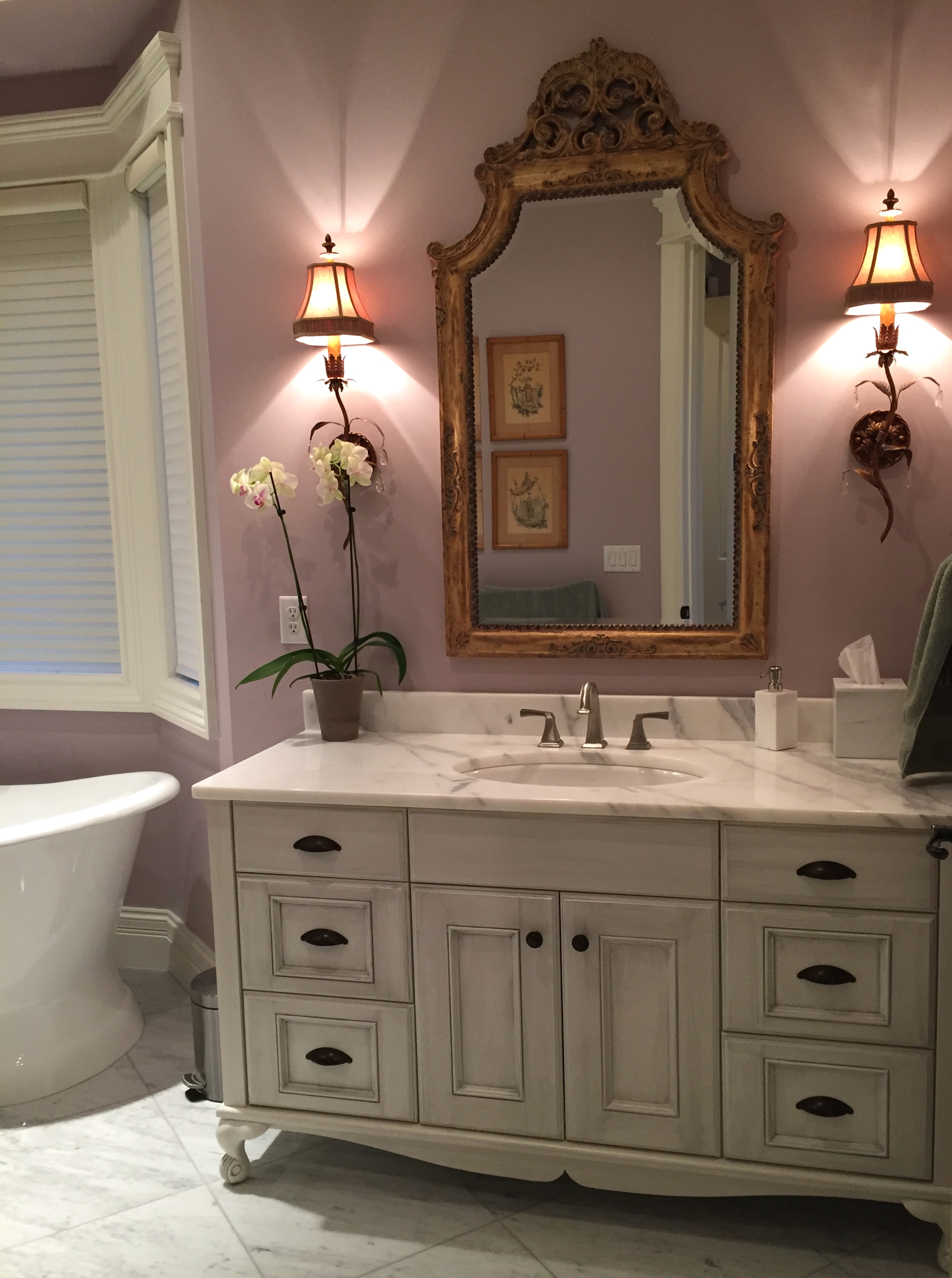
As we began our relationship, I asked my client what kind of mood and feeling she wanted in the new house she was building. She told me that the antique French furniture she had inherited from her beloved grandmother were the most important possessions she owned, and wanted them to be featured in every room. We were able to do that throughout the house, although in the master bathroom, above, we had custom cabinetry built to approximate the look she wanted.
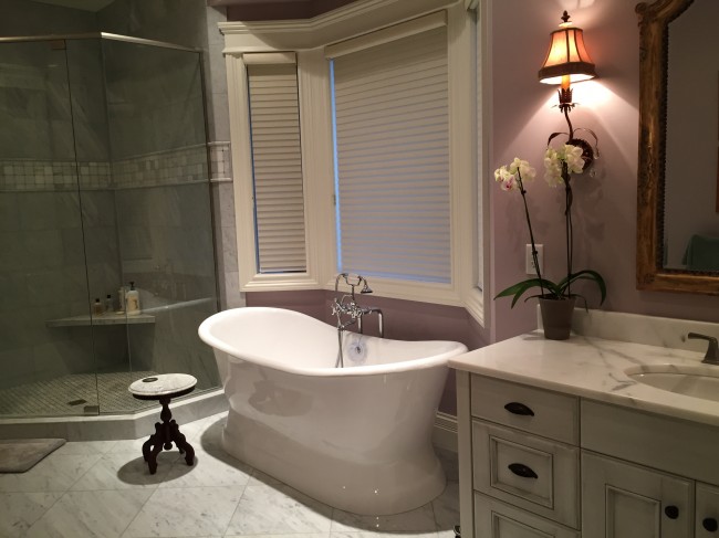 Cararra marble floor, shower walls and counter provide a classic backdrop for the custom sink cabinet and luxurious tub. The antique table provides a handy resting place for a drink while bathing.
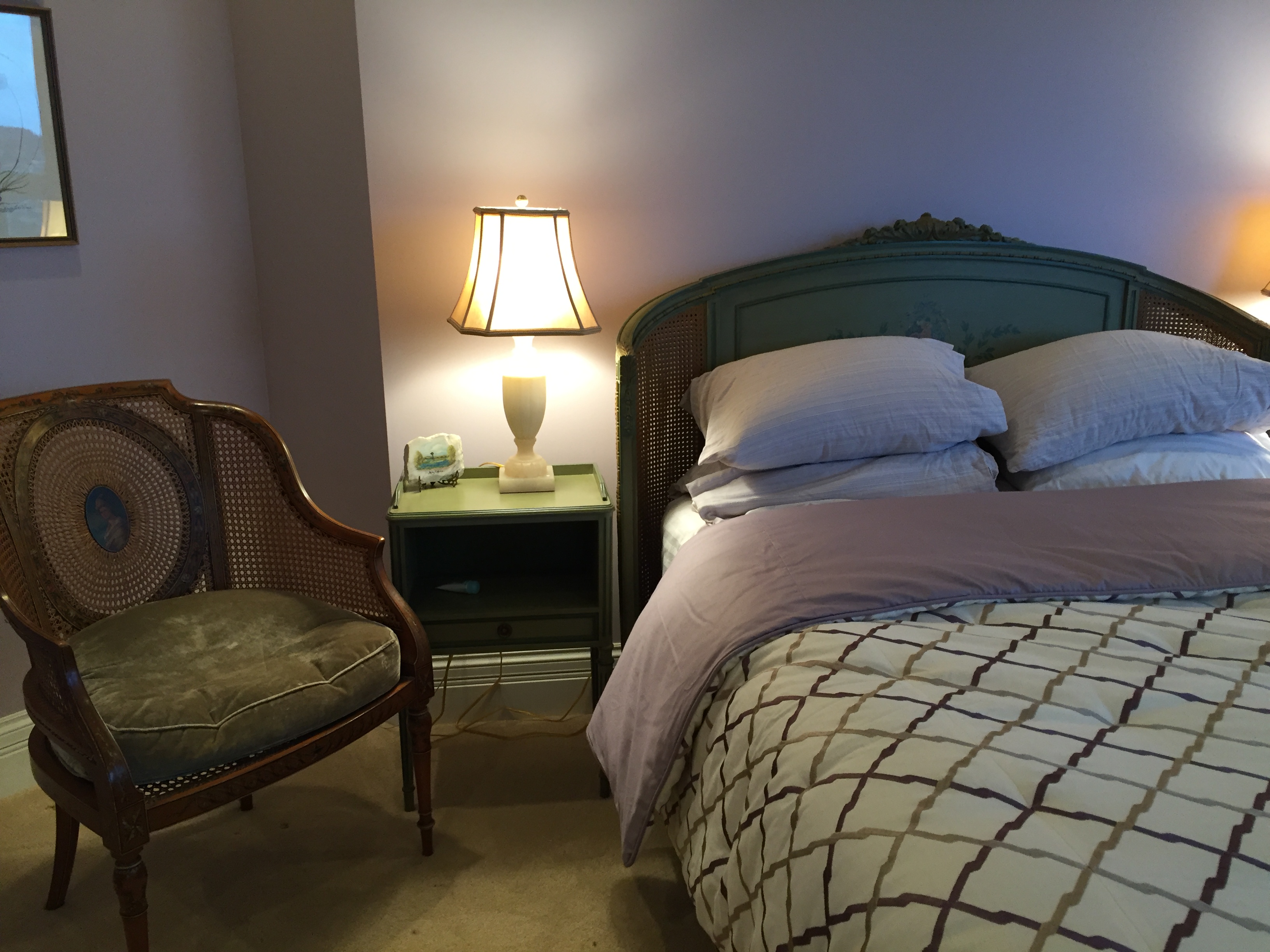
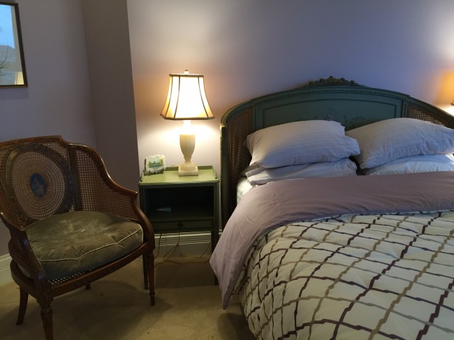 Antique bed and nightstands in the master bedroom add a contrasting apple green color against the pale violet walls, while a new custom coverlet freshens the look.
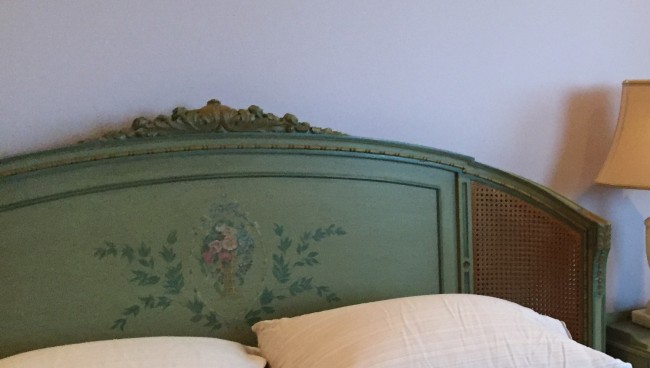
DETAIL: Carved caned headboard with hand-painted embellishment.
Emery & Associates specified interior doors, cabinetry, flooring, electrical and plumbing fixtures, hardware, and finish materials, as well as providing window coverings, drapery, reupholstery fabrics, and accessories, for this extensive new construction project. We are most grateful to the client for putting her trust in us while she was in the process of building this beautiful new home.
Tags: accessories, antiques, cabinets, Carrara marble, color, Emery & Associates, furnishings, interior design, marble, master bathroom, master bedroom

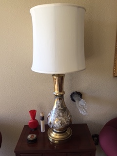
NEW SHADE ON OLD LAMP–DETAIL SHOT OF NEW CONDO
I want to tell you a story about a lamp–the one pictured above in its “AFTER” incarnation. Unlike those shows you see on HGTV, most real interior design installations are done in stages. Furnishings trickle in from various vendors, and eventually everything is in place. I wasn’t intending to write about the project pictured in the photo above until it is completely finished, because it will be spectacular when all of the client’s art work is in place, but this lamp story struck me as a really good example of how to re-purpose an accessory that otherwise may have been replaced.
Susan and Bruce Winthrop are long-time clients of Emery & Associates, and when they sold their large suburban home last year so they could downsize to an urban condo, they called us immediately. Nobody had any idea it would take so long to find a place to move into, but they finally found the perfect condo on the 23rd floor of a building in South Waterfront, with stunning views of the Willamette River. We worked together to develop a new palette and new furnishings for this condo, and we intend to have the spaces professionally photographed when everything is in place. As of now, they have received most of the new furniture except the dining table and chairs, but all of their wonderful art is still in storage. Susan had temporarily put a lamp that her mother-in-law had given her into the new living room, and even though the coffee table wasn’t in place, I took a photo of the space at that stage. My comment to Susan was “So far I’m liking everything but the lamp–maybe you could change out the lampshade.” She had similar feelings, but asked me to look for new lamps.
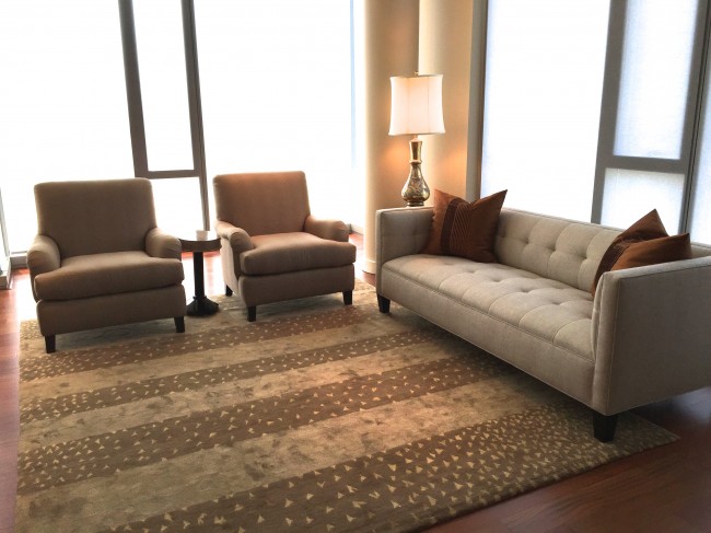
NEW CONDO PARTIALLY FURNISHED WITH NEW RUG, SOFA, CHAIRS, AND OLD LAMP
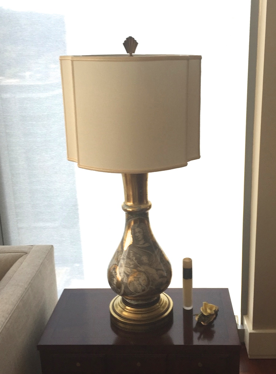
I showed the Winthrops many photos of possible lamp choices, and none of them really appealed to them, so I encouraged Susan and Bruce to look on their own at local retailers, and we discussed a variety of possible sources. Today they texted me that they had gone to Naomi’s Lamp Shop in Lake Grove (one of my favorite resources), and had the harp, shade, and finial replaced on the old lamp. What a huge difference! The proportions now look much more in keeping with their contemporary style. Look at the two versions of the same lamp, below:
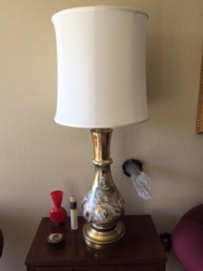
BEFORE: Lamp with old shade

AFTER: Lamp with new shade, harp and finial.
Changing out the harp (the metal frame the holds the shade) positions the shade slightly lower on the body of the lamp, and the new shade and finial changed the look of the lamp from outdated to cutting-edge. It’s all about the proportions and shape. It is also an example of how we work collaboratively with clients, so they can keep as many furnishings as possible when moving to a space that demands big changes.

It’s high summer here in Portland, Oregon, and this is NOT a gardening column. I wanted to open with these beautiful shots the charming front garden of my dear friend, Margaret Retz, because it is the ultimate in curb appeal.

Even if you are not a gardener, there are three simple things you can do to improve the curb appeal of your home.
1. INSPECT YOUR FRONT ENTRY. So many people enter their homes through their garage that they rarely, if ever, use the front entrance. You probably have no idea that your porch may look like Halloween when it’s only August! Go out through your front door, walk down to the sidewalk or street, then come back UP your front walk, and take a very good look at your porch and door. You will probably need to get a duster on a pole to get rid of all the cobwebs and spiders that are dangling around your porch lights and front door surround, and some cleaner to get all the dust off your front door and threshold. If you have a side door that faces the street, do the same there.
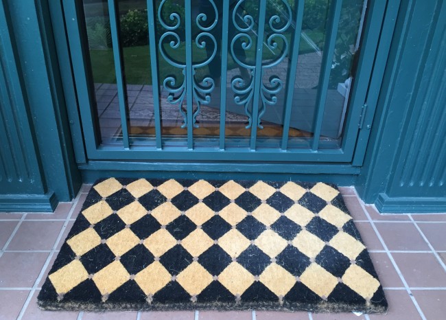
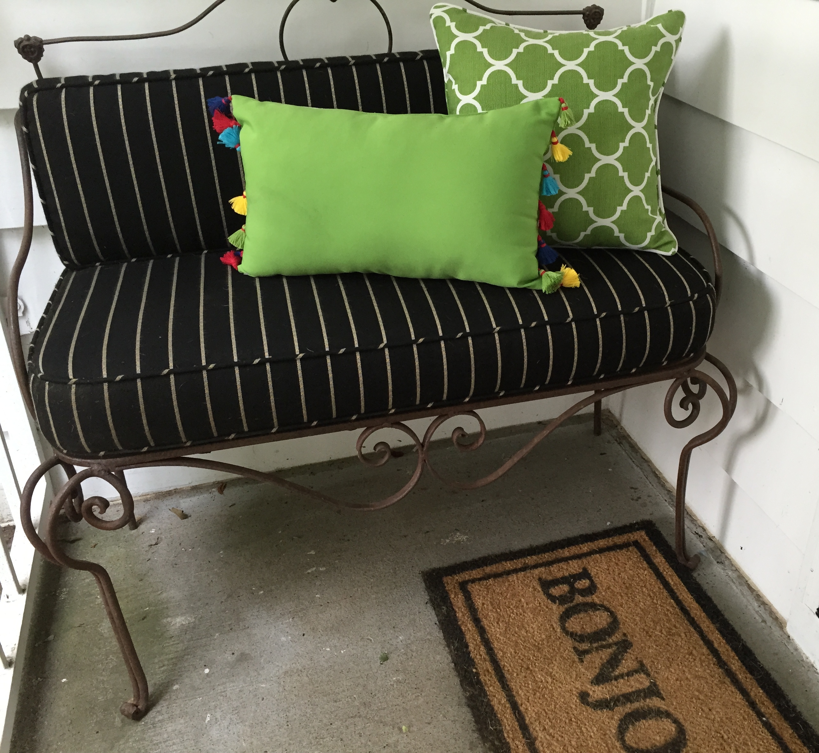
2. REPLACE YOUR DOOR MAT YEARLY. I have a favorite site where I buy a front door mat that suits my style (traditional, Harlequin checks in black/sand). It looks fabulous for about 6 months, and then slowly degrades over the rainy winter months. I flip it around, so it gets even wear, but after a year, it needs to be replaced. Whatever your style, check online and at local retailers for a new door mat that reflects your taste, and pop it onto your porch. Instant space lift! If you have a side porch that faces the street, like I do, the same rules apply, and bonus points if you have room for a bench (mine, below, is enclosed by a security gate, and the fabrics are indoor/outdoor).

3. ADD A POT WITH BEAUTIFUL PLANTS. If you are not particularly good at selecting plants, you can find many pre-planted pots at garden stores. This one came from my local Dennis 7 Dees’ Nursery on Powell, and I took it out of its plastic container and re-potted it into a terra cotta pot I already owned. Some talented garden designer picked the plants–how easy is that? This pot is on my side entry, so I only needed one. For your front porch, you most likely will need a pair of containers with a tall plant in the center, surrounded by seasonal annuals–the “thriller/filler/spiller” model. Even if you don’t have a green thumb, two pots is not much to manage. Of course, you need to water them frequently if they are under a porch overhang.

Try these three simple tricks, and your entry will become much more inviting. And who knows? You may want to start working on the INTERIOR next! Give Emery & Associates a call if we can be of help.

When Carol’s daughter grew up and left home, she wanted her daughter’s room to be done over as a guest room that her daughter would still want to enjoy when she came home to visit. She asked her daughter to choose a new headboard, and when it was in place, Carol felt stymied about what to do with the rest of the room. That’s when she called Emery & Associates.
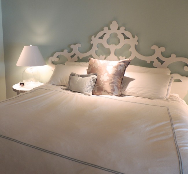
The headboard itself was a strikingly unusual wooden piece that was painted white, and we thought it would look lovely against a softly painted spa blue background. Once the wall paint was in completed, we needed the usual night stands and lamps, but Carol also wanted some art that would represent her daughter. Although I don’t usually look for art for clients because it is such a personal thing, Carol and I had worked together so long that I felt I knew her taste well enough to make a search. When I found the piece (above), by Michael Manwaring, I was immediately smitten. Titled “Portlandia,” this graphite and acrylic on canvas composition incorporates nature and organic decoration that relate to the feminine in powerful, classical statements. Both Carol and her daughter loved the piece, so it became the first art work in the room, positioned just to the left of the bed on a wall that angles away from the headboard wall.
The choices for all other furnishings flowed from the reversed figure/ground color scheme. White linens, night stands, and lamps keep the tranquil, serene feeling that is so desirable for bedrooms. Since Carol wanted guests to have a work space (and the room was large enough), I found a double pedestal white desk with mirrored drawers that added some reflective interest to the room, and a white leather and chrome desk chair. The next challenge was finding another large piece of art to go on the desk wall that wouldn’t argue with the Manwaring piece across the room from it. I suggested to Carol that we visit the studio of watercolor artist Jane Campbell.
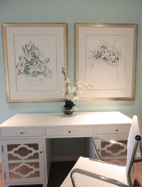
When Carol and I visited Jane’s studio, she found one piece of art that she loved (on the right, above). Problem was, we really needed TWO pieces of art that size, and there was nothing else in Jane’s studio that was a good fit. Carol asked if she could commission a second painting to pair with the first one, and Jane said “Of course!” She added that if Carol didn’t like it when it was finished, she would not be obligated to purchase it. You can see the beautiful result above.
Here’s the room BEFORE:
Guest Room BEFORE
And here is the same view of the room AFTER:

Guest Room AFTER
Art can be the jumping off place for a room makeover, or it can be the final touch that makes the otherwise impersonal room come to life. Working collaboratively with the artist AND the homeowner is one of the most satisfying ways to achieve a beautiful result. Please give Emery & Associates a call if YOU are stuck with a design project. We’d love to hear from you.
February 24th, 2015 • by Kathia Emery • • permalink
Filed In: accessories, antiques, art, drapery, furnishings, interior design, lighting, remodeling, textiles, upholstery, window coverings
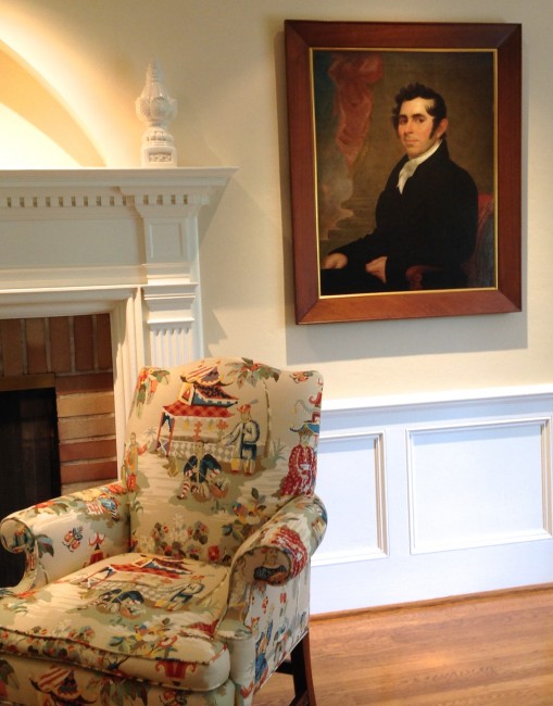
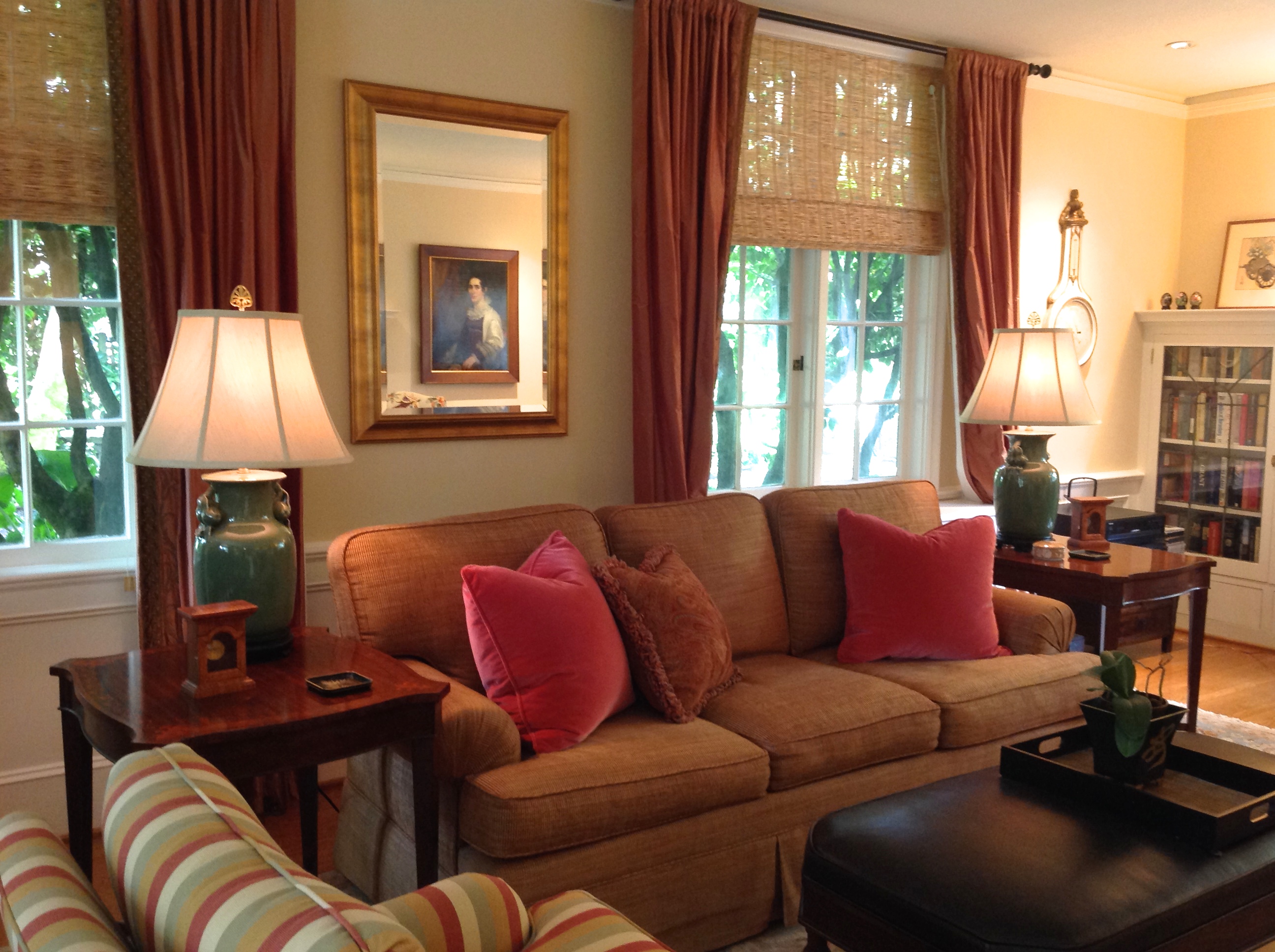
The Bauman family recently inherited two magnificent ancestor portraits, which deserve to be prominently displayed in their living room. Fortunately, when we remodeled their living room four years ago, we added new recessed lighting, even though adding lighting wasn’t on their original list of “must haves.” (See my very first post on this site–put title “Tricks for Transformation” into the search box). I recommended the new lighting on general principles, and in anticipation that these paintings would arrive at some point in the future. That day has arrived.
Here are the good people from Fine Art Services hanging the corresponding portrait to the left of the fireplace:
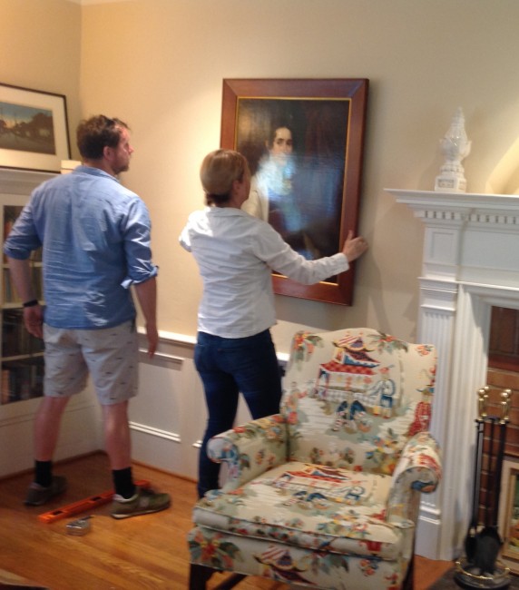
It pays to have professionals hang paintings for you, especially if you live in a house with lath-and-plaster walls. I was on site to give my two cents about positioning, but these pros really didn’t need my input (they do work for galleries all around the region).

I love how the ancestor portrait is reflected in the mirror above the sofa.
Retrofitting recessed lighting in an older home is always a messy, expensive option, but nothing makes as much impact to an interior. It’s one of those changes that we at Emery & Associates lobby for on any project with the budget for major transformation. I’m so grateful that the Baumans saw the value of doing new lighting, even though it was four years before they inherited the paintings that are being illuminated. It pays to plan ahead!
Tags: accessories, art, Chinoiserie, Colonial home, color, drapery, Emery & Associates, fireplace, furnishings, lighting, living room, window coverings
November 29th, 2014 • by Kathia Emery • • permalink
Filed In: accessories, antiques, art, color, fireplace, flat screen TV, furnishings, interior design, lighting, remodeling, restorations, reupholstery, rugs, textiles, upholstery
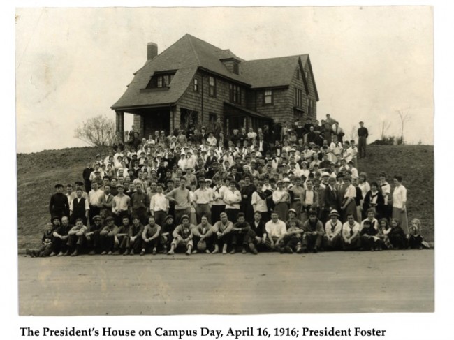
Last year I was asked by my alma mater, Reed College, to help with the re-design of the Prexy Building on the college campus. It was designed in 1914 by the renowned Portland architect, A.E. Doyle, as a home for the college president, hence its name. The building was subsequently used as a boys’ dorm in the 1940s and ’50s. Starting around 1960, Prexy was the music building, where students (including myself) went to practice the piano or other instruments. When the music department moved to its new home in the Performing Arts Building in 2013, the college decided to repurpose Prexy as the Office of Alumni and Parent Relations and the Center for Life Beyond Reed. Staff offices would be on the upper floors, but the college wanted a residential feeling for the entry and living room of this historic house, so even though there was an architect doing much of the construction design, Emery & Associates was asked to do the concept and furnishings for the entry and living room in order to make the spaces feel inviting, and uniquely Reed-like. Here’s a “BEFORE” photo I took the first day I met with the architect and Reed staff members:
Prexy Living Room “BEFORE”
The architect and I agreed that if we were going to keep the dark wood trim throughout the main floor, which the college staff wanted, we needed to add recessed lighting in the ceiling, and keep the walls fairly light colored. We were all hoping that under the worn industrial carpeting there would be hardwood floors that could be refinished, and in fact, that turned out to be the case. My challenge was to come up with a furnishings concept that would keep the English cottage style feeling that A.E. Doyle intended, but would still be functional and inviting for alumni, staff, and students today. I began by pondering some old photographs of the house as it was furnished nearly 100 years ago:
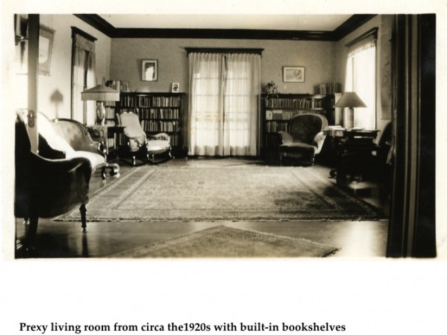
As I contemplated the kinds of furnishings that would have existed around the turn of the century, I was inspired to explore the English Arts and Crafts movement, since it was born of ideals that grew out of a concern for the effects of industrialization, placing great value on work, the joy of craftsmanship and the natural beauty of materials. Eventually, I found myself looking at reproduction hand-blocked wallpapers from the period. As soon as I spotted the “Lion and Dove” frieze (see below), I knew I had found my starting place. The calligraphic banner alone knocked my socks off (calligraphy having been a major aspect of Reed life for many decades), and the roses represented the City of Portland in my mind. I loved the earthy color palette, and thought it would pair nicely with the dark wood trim. And the lion and dove? Well, you just need to keep reading!

Key Design Element: Lion & Dove Wallpaper Frieze by Walter Crane
Walter Crane was a socialist artist involved in the creation of the Arts and Crafts Exhibition Society and the Art Workers’ Guild in England. He worked alongside prominent artists of the day such as William Morris and Edward Burne Jones, who shared the belief in the socially reforming power of art that could be appreciated and consumed by the masses. They repudiated the idea that fine art was “higher” than decorative art. This magnificent wallpaper frieze was Walter Crane’s critical response to the Second Boer War (1899-1902). In this very floral design (c. 1901), Crane features the belligerent British Imperial Lion being gently pacified by the White Dove of Peace. The text of the calligraphic banner, “The Wilderness shall blossom as the ROSE,” is a paraphrase of the words found in the first verse of the 35th chapter of the Book of Isaiah. Bradbury & Bradbury, an American company that specializes in hand prints from the English Arts and Crafts and Aesthetic Movement, made the hand-blocked reproduction. The original frieze resides in the Victoria and Albert Museum in London.

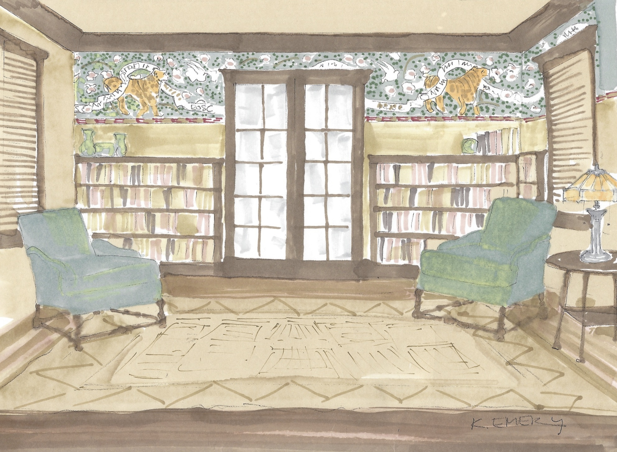
Kathia’s Concept Sketch for Prexy Living Room
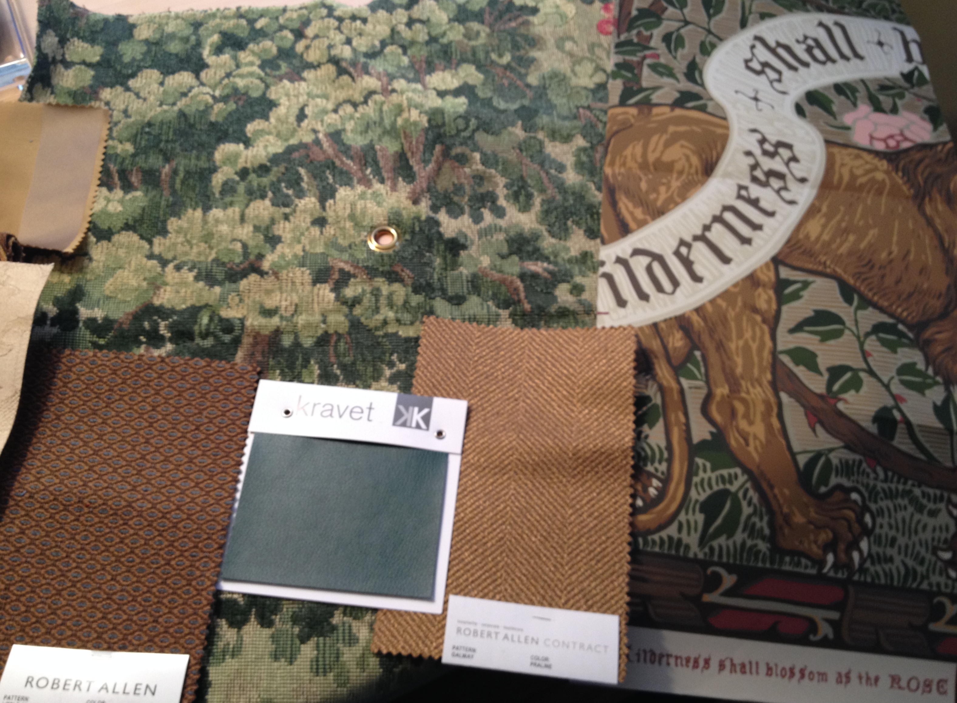
My concept sketch (above) shows how the wallpaper frieze would scale out on the focal wall above the bookshelves, and I presented it, along with a color board of textiles (below), to the college staff for their approval.
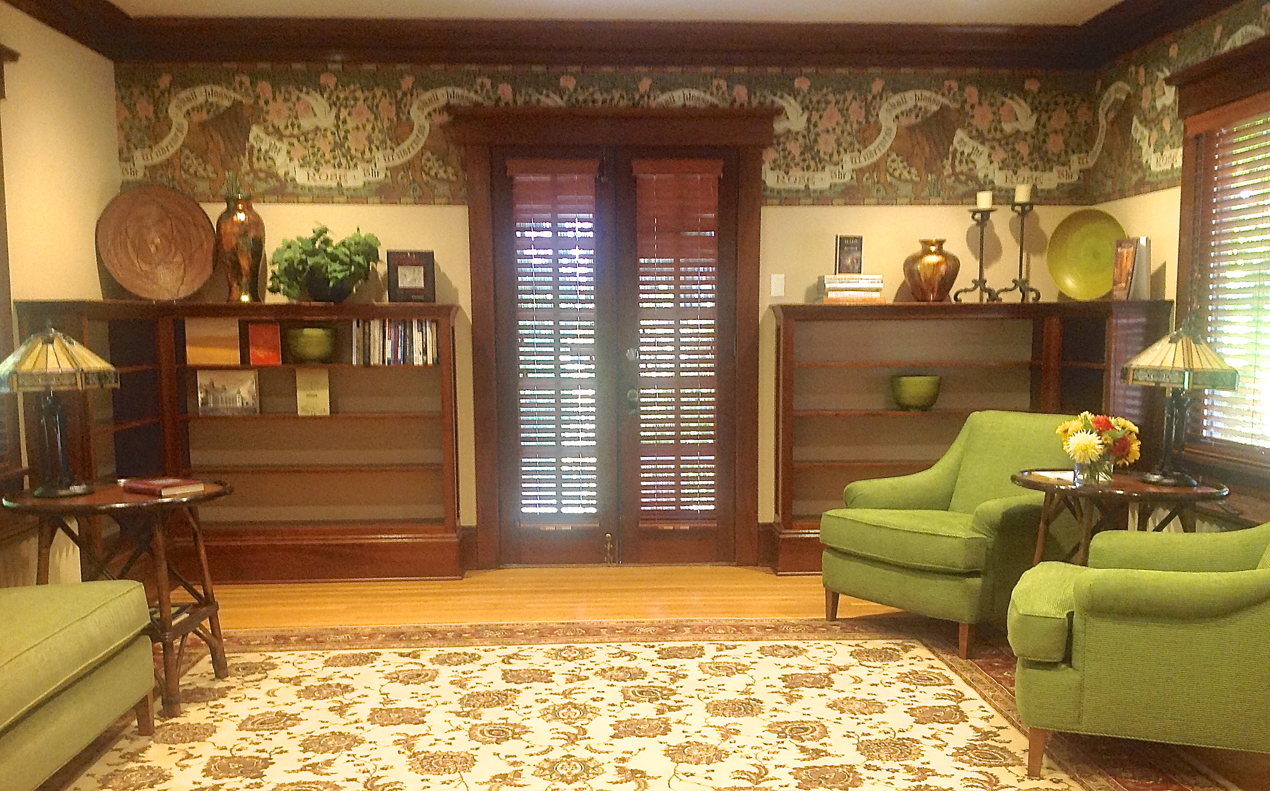
 With the concept and color palette established, I also gave them a scaled out furniture plan for upholstery that would be custom built locally for the space. Once the college approved my designs, we placed the orders, and all of pieces went into production. By the end of summer, we were ready for the installation. Here is the “AFTER”shot of the living room:

What you can’t see in this shot is the large screen TV that is mounted on the wall opposite the pair of chairs. Since this photo was taken, we have also made a lot of progress with filling the bookshelves with books by Reed authors.
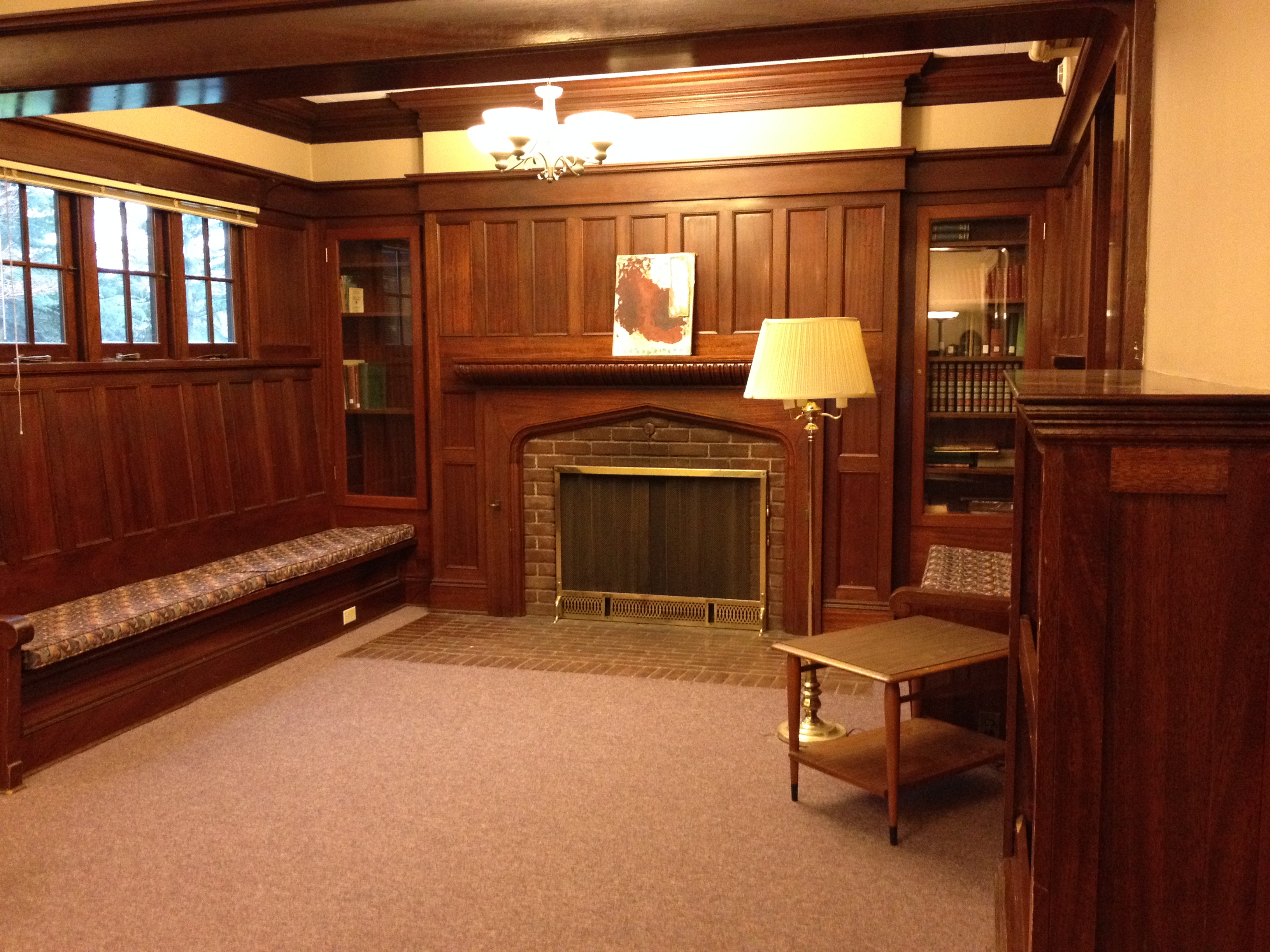
Adjacent to the living room is a charming inglenook–a fireplace with built-in bench seating on either side, paneled in dark wood. We added a rug, reupholstered the cushions, added some large toss pillows, and a number of accessories to enliven this area. Here is the inglenook BEFORE:

Prexy inglenook BEFORE
Here is the inglenook AFTER:
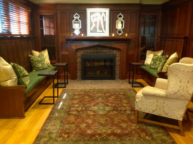
Prexy Inglenook AFTER
Inglenook detail: The art print and candle sconces pop against the dark wood.
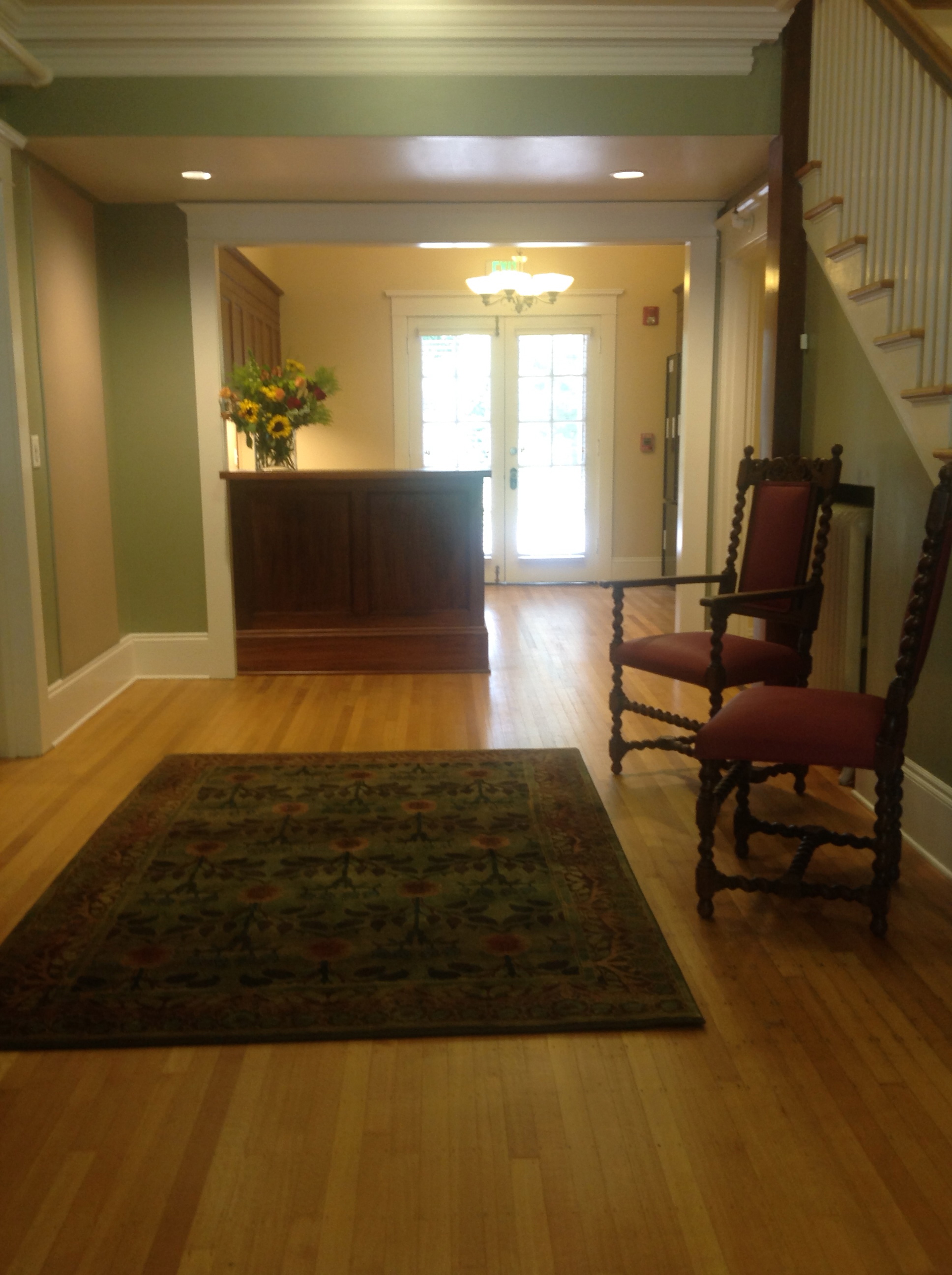
And at last comes the entry, which looked like this BEFORE:
Prexy entry BEFORE
The refinished hardwood floors make the most dramatic difference–they gleam and reflect the light. A new reception desk says “welcome,” and the area rugs and reupholstered antique chairs invite one in. Prexy feels like a home again!

My thanks to the Alumni Office staff at Reed College for being such a pleasure to work with, especially Mela Kunitz, Mike Teskey, and Todd Hesse; to Reed Archivist, Gay Walker, for providing the information and historic photos of “olde Reed”; to Jennifer Russina, AIA, from ZGF, for her design skills and for pulling with me about the lighting; to Michael Conner, wallpaper installer extraordinaire; and Jack and Luis at Design Furnishings Inc., for all of the upholstery.

Tags: accessories, art, color, Emery & Associates, fireplace, flat screen TV, furnishings, interior design, lighting, living room, pillows, reupholstery, upholstery
August 8th, 2014 • by Kathia Emery • • permalink
Filed In: accessories, art, cabinets, color, countertops, flooring, interior design, kitchen remodel, lighting, makeovers, marble, remodeling, stone


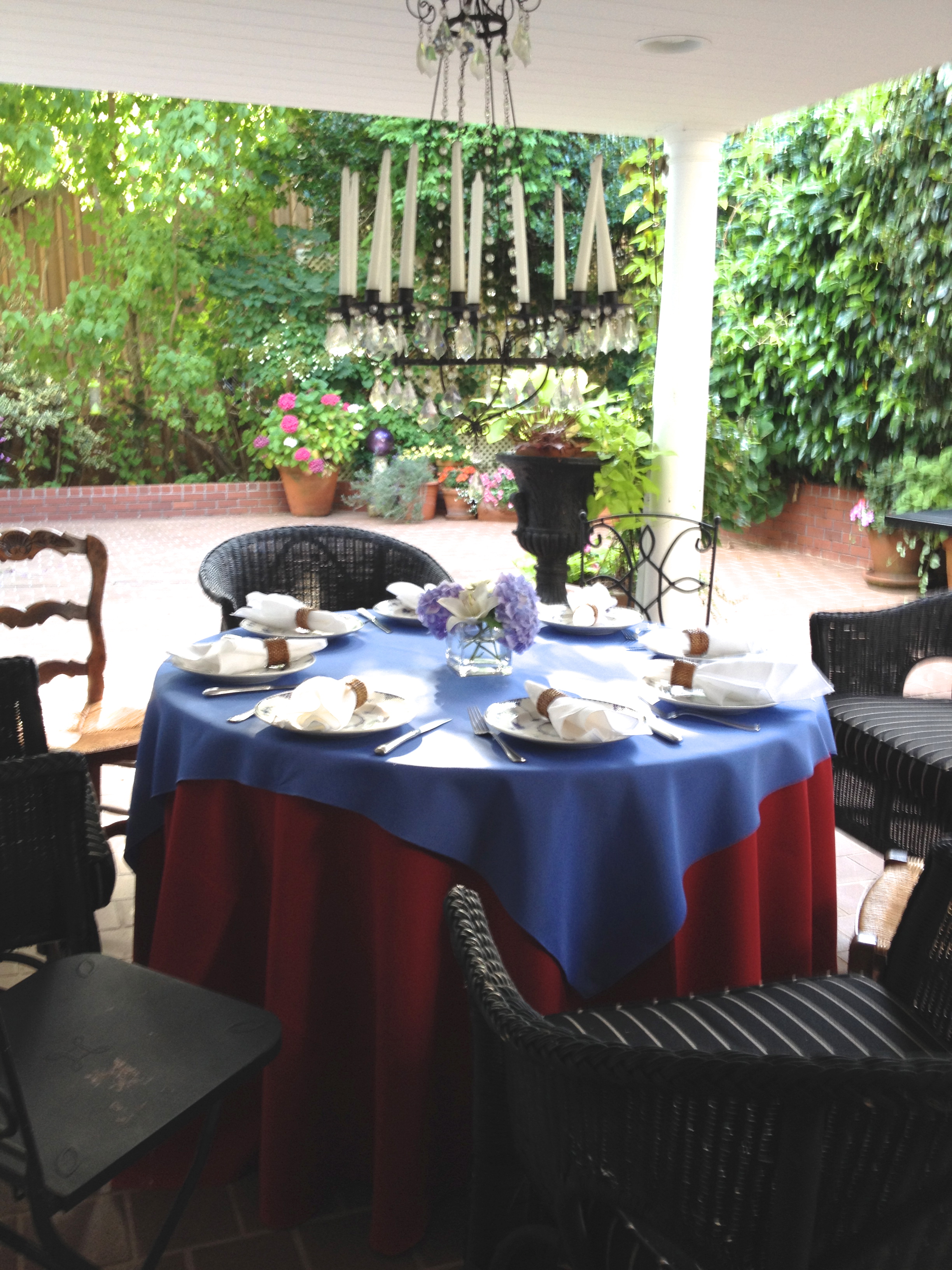
Kathia and Jim’s 4th of July table
We are blessed in the Pacific Northwest with a moderate climate that makes outdoor entertaining possible from May through September. If you are new to outdoor entertaining, here are a few tips to make it easy and fun:
1. FOOD: Don’t try to do it all yourself. Plan simple menus, prepare most things the day before, and take advantage of the amazing variety of items you can purchase from specialty stores. One of my good neighbor friends, Marsha Buono, tipped me off to New Seasons’ pimento cheese dip for crudités, and Trader Joe’s mushroom turnovers. Yum! You could do entire menu with take out. Put everything on your own beautiful serving dishes–who will know?
2. SEATING: Mix and match chairs to make enough seating if you are planning a sit-down meal. We have wicker, iron, and wooden chairs from inside the house mixed in the photo above to seat 8 around the 48″ diameter table. If you are planning a really large party, and don’t have enough seating, become acquainted with your local party rental company. Most of them deliver, and it’s well worth the money for guests to have places to sit.
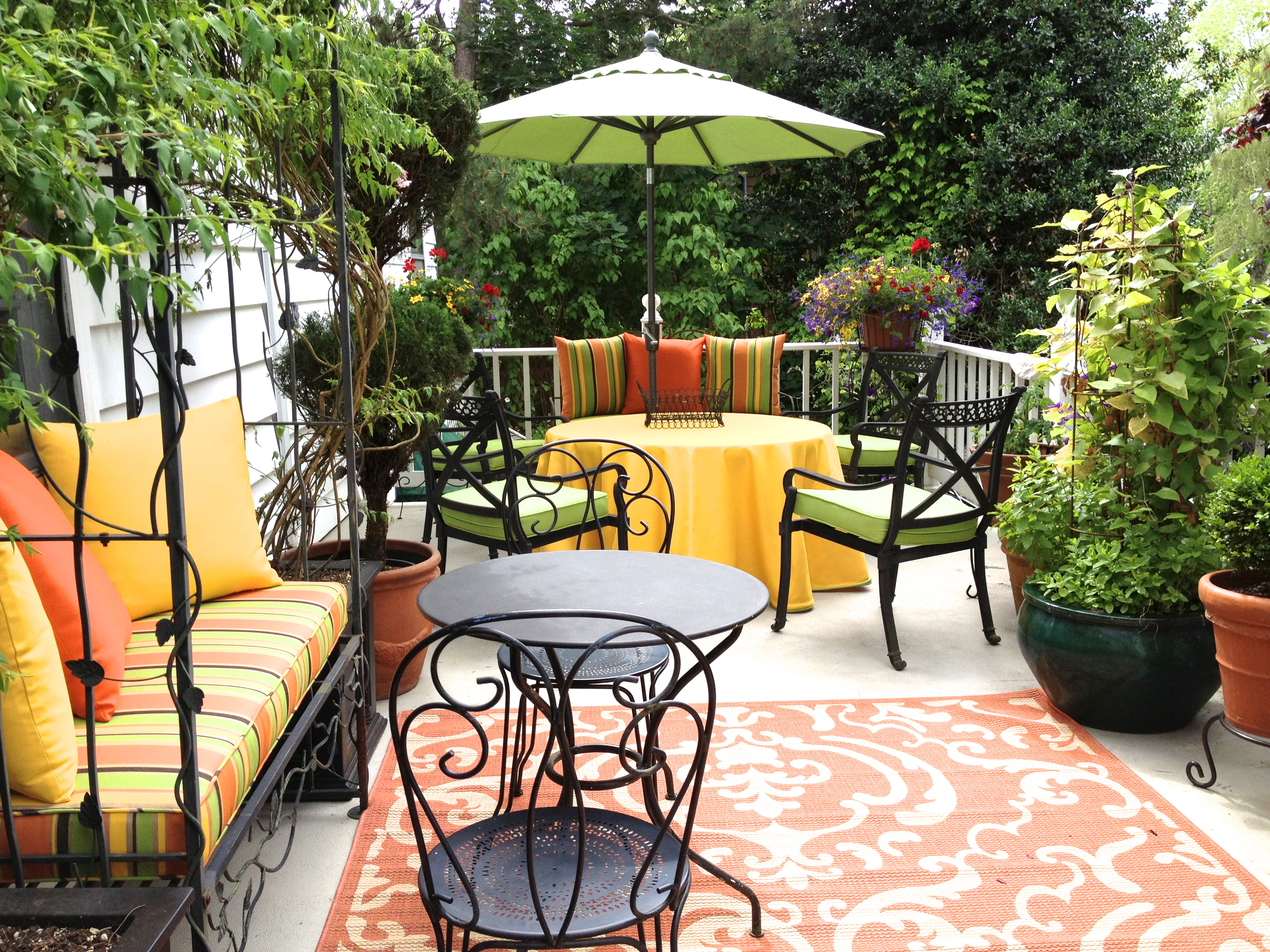
3. TRAYS: One can’t have too many trays. They are useful for grouping condiments, coffee service, barware, drinks, and many other small items, and necessary for transporting things from indoors to outdoors and back again. A rolling teacart (photo below), which is a tray on wheels, can be useful as a drinks station, dessert server, or auxiliary buffet.

4. SHELTER: Make sure to have something to give respite from the elements. You can see from the photo above that our dining table is sitting underneath a porch overhang. If you don’t have a built-in shelter, add a large umbrella to your outdoor space (see photo below). If you are having a really large party, and the weather is dicey, renting a canopy makes good sense.

Jim and Kathia’s upper deck
5. COLOR: Pretty dishes and table linens, along with pots of plants, add interest and seasonal color . Cloth napkins and tablecloths, and food served on real dishes, are my preference if we are having 8 people or fewer, but for a large crowd I go with paper plates and napkins. Do what works for YOU–it’s the social aspect of the party that is important. If you don’t want the expense of buying linens for a once-a-year event, give the party rental place a call (that’s what I did this year, since I don’t own a 108″ round, red tablecloth, and really wanted red/white/blue for the 4th of July).
Entertaining friends in the summer is a delight if you plan ahead and start small. It gets easier the more you do it. All of the items I’ve mentioned above are available at a variety of price points, from garage sales and thrift stores to expensive retail outlets. I’ve been collecting dishes and linens for years (my husband teases me that we have enough sets of dishes for TWO Kosher families), but you don’t need multiple sets of dishes to entertain well–just the desire to enjoy the company of friends in your own backyard.
April 28th, 2014 • by Kathia Emery • • permalink
Filed In: antiques, color, dining room, dogs, drapery, furnishings, interior design, makeovers, pets, rugs, window coverings
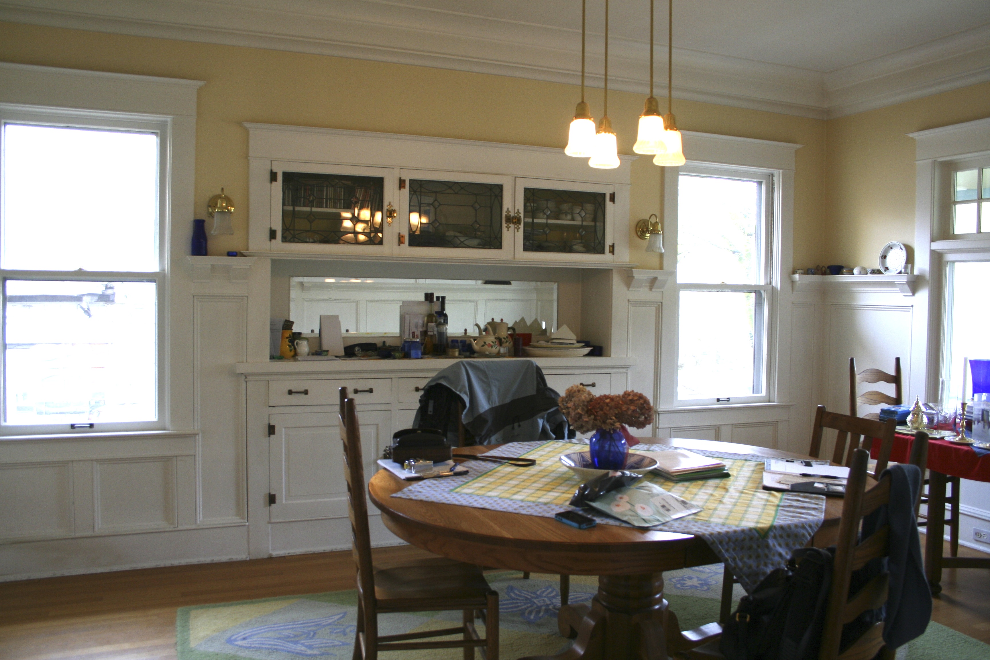
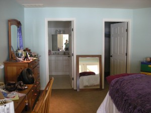
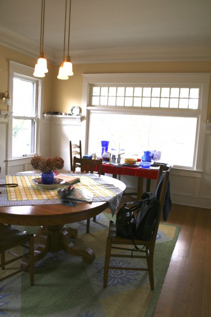
 It’s not often that I design a room around a dog, but Samoa is a very special dog. She’s a Bernese Mountain Dog, and it was her chewing behavior as a young dog that prompted her owners, Sue and Bob Van Brocklin, to ask Emery & Associates to redecorate their family room. Eventually we worked our way to the dining room, and when we brought this rug to their home, Samoa immediately gave it her stamp of approval. Here’s what the dining room looked like BEFORE:

DINING ROOM BEFORE
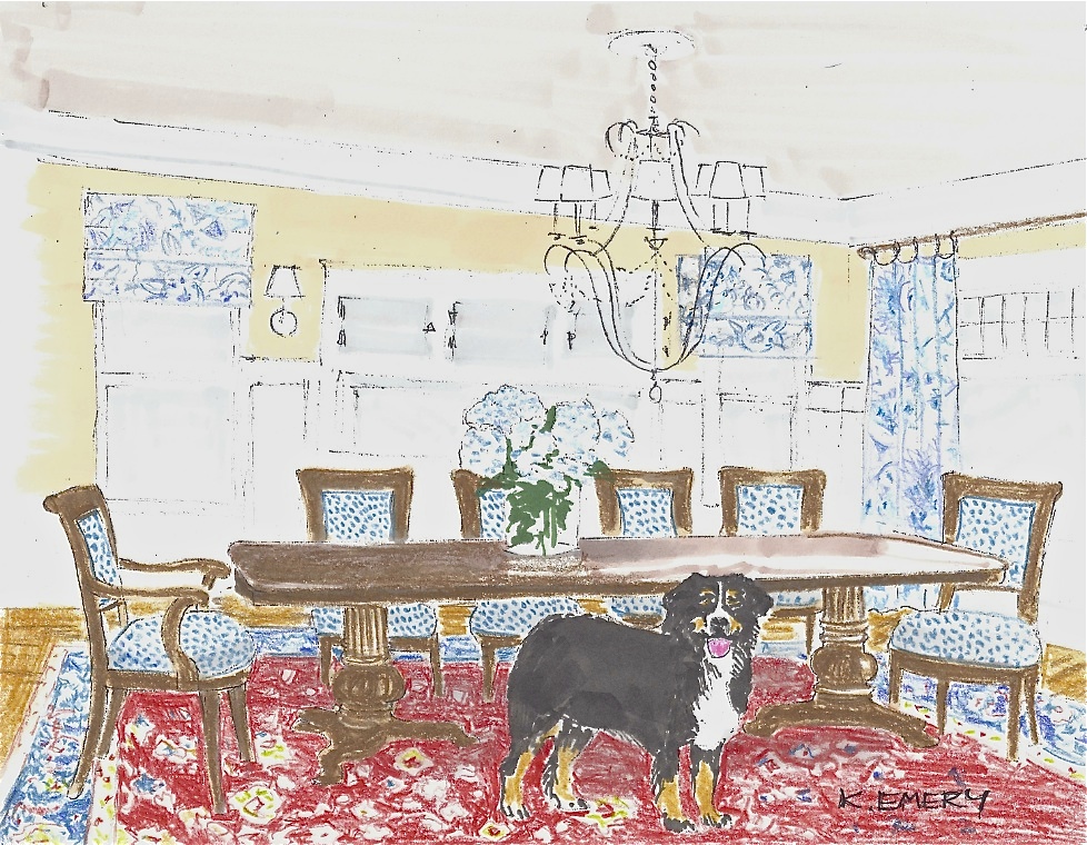
We spent a lot of time talking about their lifestyle and what they love. They love traveling, especially in France, and have collected French dishes in Monet’s pattern, and French Indienne linens. Their old furniture had served them well while their children were small, but they were grown up now, and Sue and Bob wanted furnishings that reflected their current taste and interests. They wanted a dining table large enough to seat their extended family for holidays, and comfortable dining chairs. They needed everything redone: walls, window coverings, rug, furniture, and lighting. When I presented them with my concept sketch for the makeover, I told them it was easier for me to draw a picture of Samoa than four more dining chairs.
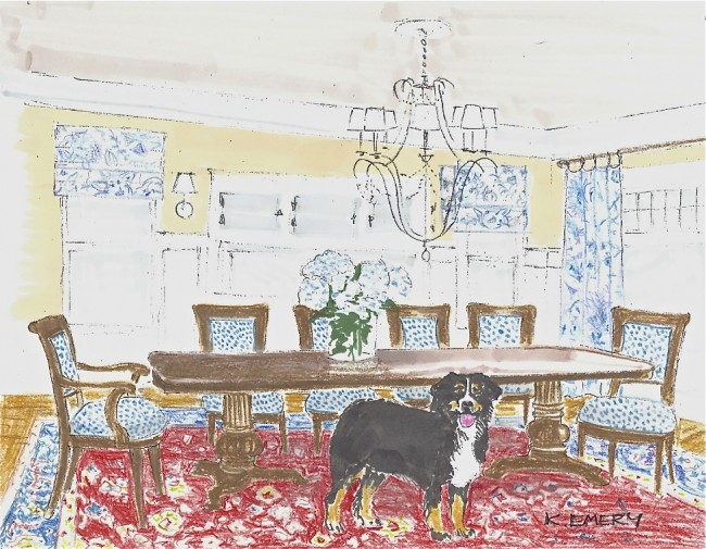
KATHIA’S CONCEPT SKETCH
Along with the concept sketch, I also presented a vision board with fabrics, furniture finishes, rug ideas, and photographs of dining table and chairs:
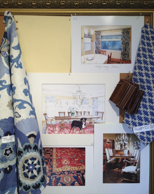
VAN BROCKLIN DINING ROOM VISION BOARD
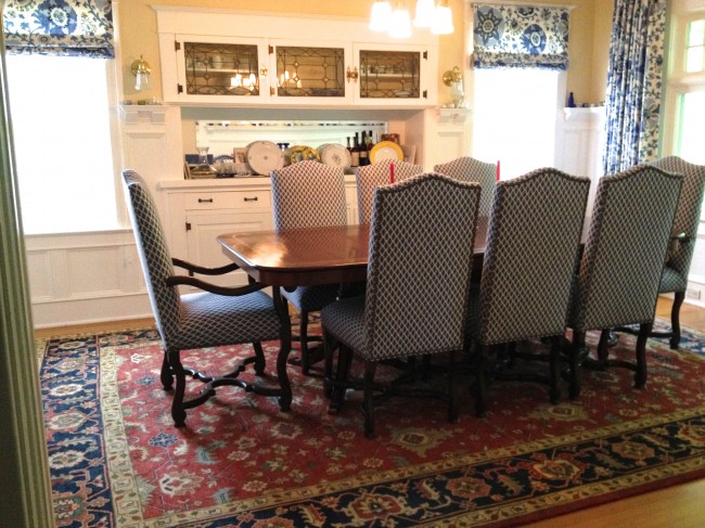
The “BEFORE” room was calling out for a mix of color and pattern to wake it up. I found a fresh blue and white fabric from Pindler & Pindler for the Roman shades that flank the built-in buffet, and used it to drape the large front window as well. The drapery adds softness and color, and a bit of sound dampening. The next piece was the rug from NW Rugs, which adds a pop of red to the blue/white/yellow palette, and also the advantage of enough pattern and color to hide a multitude of sins, including Samoa’s paw prints, food crumbs, and spills. The small blue and white textured fabric from Brunschwig & Fils was the perfect choice for the dining room chairs. The classic “Tula” table from Ebanista, is eight feet long most of the time, but expands to ten feet when needed for larger groups. Since Bob is 6’5″ tall, the French antique mouton chairs they both loved were not practical. My upholstery workroom created the custom-sized chairs to accommodate modern dining height, with a slightly higher and deeper chair for Bob. The trick was to make sure that the arm of the host chair, and the host’s knees, would not hit the apron of the table. So far, so good! Here’s how the room looks now.
 When I took the “BEFORE” shot (below) of the dining room, looking toward the front window, the table under the window had been used to extend the former dining table for large holiday meals. It had also became a dumping spot for clutter.
DINING ROOM BEFORE, VIEW TO FRONT WINDOW
Since the new table can grow to fit their large extended family, and the original built-in buffet has been re-styled, the dining room doesn’t need a secondary table anymore. The rug is sized to fit the generous proportions of the room, large enough that the chairs can be pushed back without them falling off the rug, but allowing a band of the beautiful hardwood floors surrounding it to show. This room is company ready!
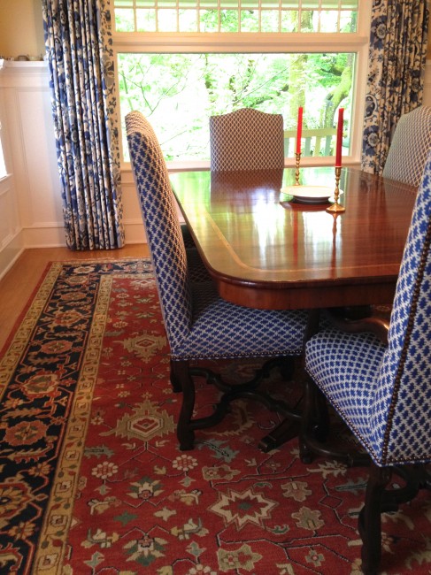
DINING ROOM AFTER, VIEW TOWARD FRONT WINDOW
We love working with families who have children and pets. Nothing is more wonderful than the fun of watching their antics, not to mention the companionship and unconditional love they give us (well, dogs give us unconditional love–cats and kids, not so much). On the other hand, nothing is more frustrating than the muck, disorder, and chaos they can cause. If you need help decorating around kids, cats, and dogs, give Emery & Associates a call. We can help. We’ve been there.