Always Sunny in Portland, Oregon
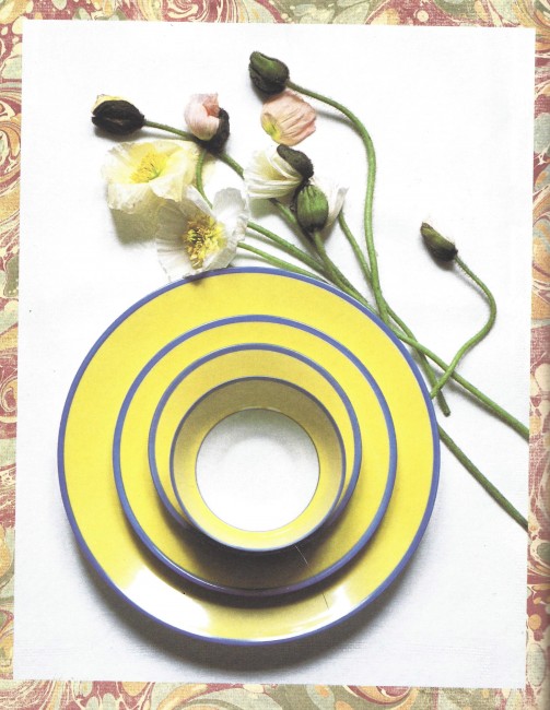
Yes, I’m kidding. But even on dark and rainy days the mood in this room is sunny and warm, like a day in Provence. When we first started talking about what kind of changes they wanted in their home, Sue and Bob Van Brocklin let me know their color and style preferences, and we spent a lot of time talking and walking through the house, discussing the things that they loved and didn’t love about their home. We began in the kitchen nook (see my post “French Dressing for Kitchen Nook,” under category “kitchen nook”), which firmly established the blue-and-yellow color palette. Sue had a large collection of table linens, china and other objets d’art from France, including the very china from Monet’s table in Giverny. This became our color palette inspiration.
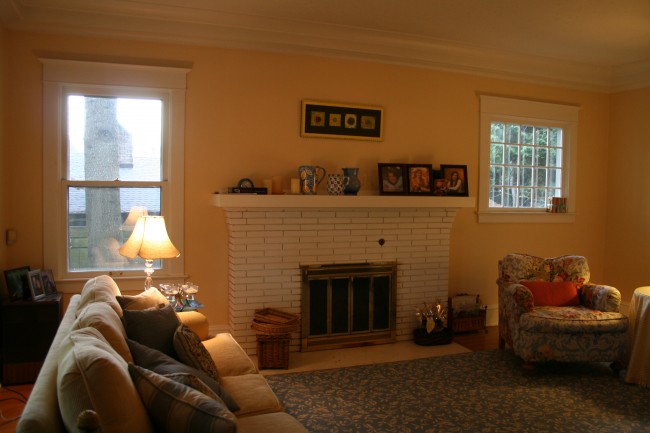
 My challenge was to determine what else needed to be changed to make the space warm and inviting, and to present the changes to Sue and Bob. Here’s what their living room looked like BEFORE:
They told me they rarely spent time in this room, and it was obvious to me why they didn’t. For starters, the furniture arrangement didn’t encourage conversation. The sofa and chairs were too far apart, there was no coffee table to set down drinks or snacks, and the colors were bland. The lighting was dim, and the fireplace wall, with the oddly mis-matched windows flanking it, lacked charm.
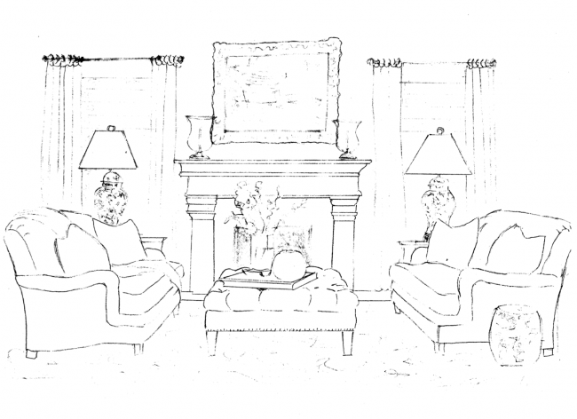
I did a concept sketch of the fireplace wall, showing a European-style carved stone fireplace to create a dramatic focal point for the room. I also added drapery to minimize the window differences, and pairs of sofas, lamp tables, and lamps, to give a slightly more formal and dressy feeling.
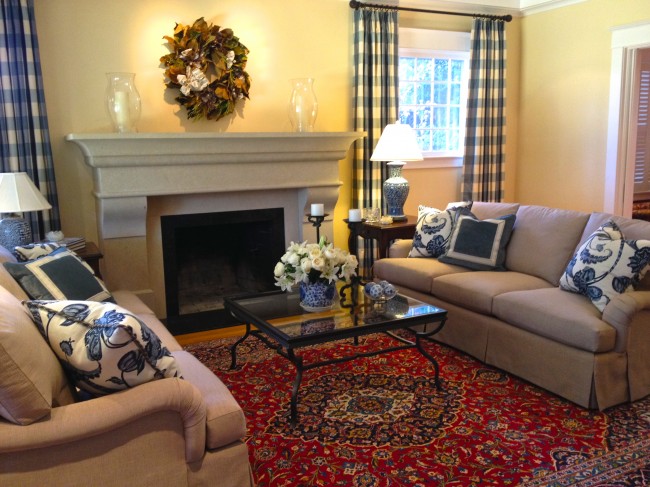
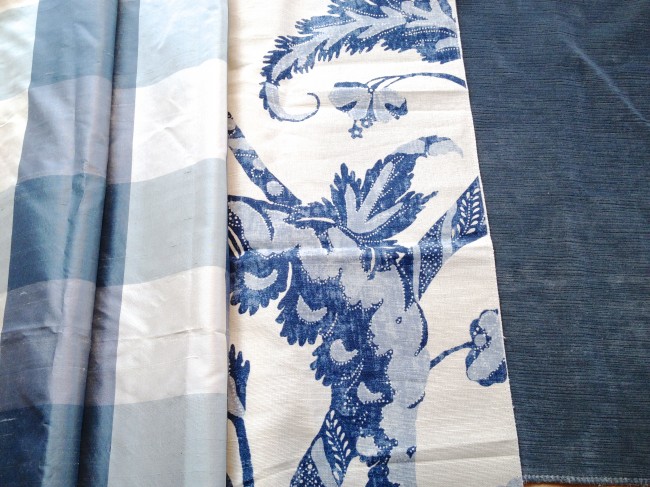
I presented blue-and-white fabrics for drapery, upholstery, and pillows, which would contrast beautifully against the sunny golden walls, and a magnificent Oriental rug from NW Rugs, which added a vibrant tone of red. New recessed lighting in the ceiling, on dimmers for maximum control, would keep the room warm and inviting no matter what the weather or time of day.
Last week a friend sent Sue and Bob a lovely magnolia wreath, so I suggested they put it above the magnificent custom-carved limestone fireplace, fabricated by the Stone Center, for the holiday season, since we are still on the lookout for the perfect piece of art.
We finished this room the day before Thanksgiving. My gratitude is unbounded for Sue and Bob’s willingness to go along with my ideas for their space, as well as for the massive inconvenience and mess that goes along with a major renovation of this kind. Emery & Associates is also grateful to all of our vendors and skilled artisans, who work so hard to create beauty and value for our clients. This response from the Van Brocklins warmed our hearts:
“Thank you so very much for making such an improvement in our home! We truly love everything you did in the living room.”




There are 6 Comments to "Always Sunny in Portland, Oregon"
Kathia, the beautiful draperies disguise the oddly matched windows, and the new coffee table and sofas make a lovely space to sit for a cup of coffee and conversation. But the piece de resistance is the fireplace, which is a significant upgrade and combines both solidity and grace. This room is sooooo much better!
Such a wonderful job, Kathia. I am betting they will be hanging out in that room a lot more now. That is what is so rewarding about design work – you impact the lives of a family in such an intimate way. Kudos.
Once again, you’ve transformed a space that was awkward and unappealing to one that is welcoming, gracious, and full of interesting detail. The draperies do a masterful job of fooling the eye. So glad you had close-ups of the fabric; they are much richer and more textural than they seem at a far glance. I’m sure the home owners must be thrilled. Holiday reds would also look fabulous in that setting. Congrats to you and your team!
Kathia,
Your most recent blog post on the living room redo in this home, illustrates the extension of the palette and “identity” which you originally established here in the breakfast nook. I was referred to this post by the most recent one with particular interest in how you interpreted the owners love for all things Giverny.
As a professional artist and sometime decorator (who needs you desperately), I thought that the interpretation of the splendiferous colors of Giverny would be extremely difficult to interpret in an environment intended to feel “restful” as well as exciting and edgy as the Giverny contrasts can be. The mere saturation of color and judicious use of same is a major accomplishment which I believe you have accomplished in this home. Even more impressive is the ability to continue the theme throughout the home without allowing the design to interfere with the day to day enjoyment and experience of the home–the design sets the stage very cleverly for the Provence feeling that you were working to achieve. Most impressive! It is no wonder that so many clients entrust you with major decisions regarding their life spaces.
Thank you so much for sharing your process and sources, as well. This is most helpful to those of us who do not live in the Portland area but wish to make use of your ideas.
Having been to Giverny, I would love to replicate the wonderful feeling experienced there and have never seen anyone interpret that home without having the design overtake the home. I so love what you did and appreciate the sophisticated color decisions that you made along the way.
The red in the area rug caught my eye and immediately drew my attention into the seating area and to the elegance of the redesigned fireplace. The room has been transformed into a calm and inviting place to relax and unwind.
Striking how the smooth stone fireplace kicks the whole look into a different era and does a continental change to the room. And, it’s even more cozy, relaxed and bright!