Repurposing Prexy
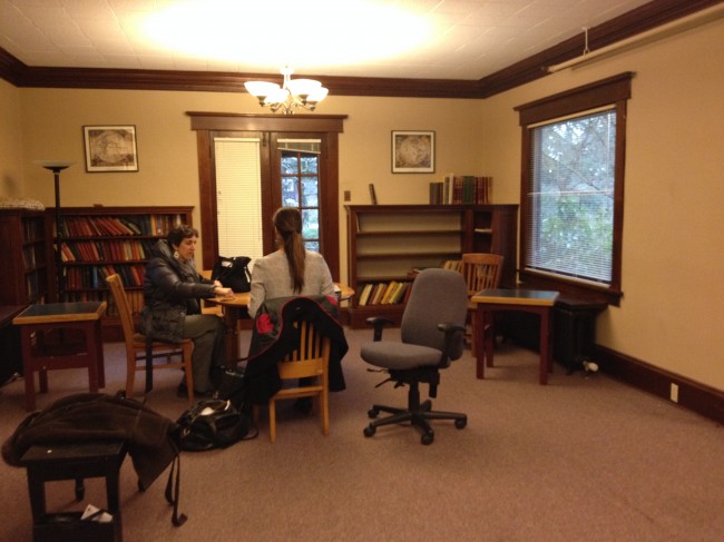
Last year I was asked by my alma mater, Reed College, to help with the re-design of the Prexy Building on the college campus. It was designed in 1914 by the renowned Portland architect, A.E. Doyle, as a home for the college president, hence its name. The building was subsequently used as a boys’ dorm in the 1940s and ’50s. Starting around 1960, Prexy was the music building, where students (including myself) went to practice the piano or other instruments. When the music department moved to its new home in the Performing Arts Building in 2013, the college decided to repurpose Prexy as the Office of Alumni and Parent Relations and the Center for Life Beyond Reed. Staff offices would be on the upper floors, but the college wanted a residential feeling for the entry and living room of this historic house, so even though there was an architect doing much of the construction design, Emery & Associates was asked to do the concept and furnishings for the entry and living room in order to make the spaces feel inviting, and uniquely Reed-like. Here’s a “BEFORE” photo I took the first day I met with the architect and Reed staff members:
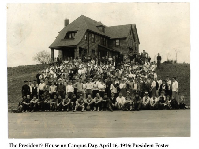
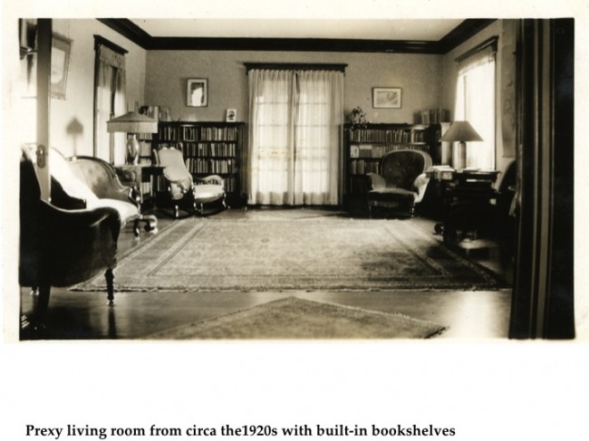
The architect and I agreed that if we were going to keep the dark wood trim throughout the main floor, which the college staff wanted, we needed to add recessed lighting in the ceiling, and keep the walls fairly light colored. We were all hoping that under the worn industrial carpeting there would be hardwood floors that could be refinished, and in fact, that turned out to be the case. My challenge was to come up with a furnishings concept that would keep the English cottage style feeling that A.E. Doyle intended, but would still be functional and inviting for alumni, staff, and students today. I began by pondering some old photographs of the house as it was furnished nearly 100 years ago:
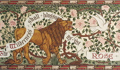
As I contemplated the kinds of furnishings that would have existed around the turn of the century, I was inspired to explore the English Arts and Crafts movement, since it was born of ideals that grew out of a concern for the effects of industrialization, placing great value on work, the joy of craftsmanship and the natural beauty of materials. Eventually, I found myself looking at reproduction hand-blocked wallpapers from the period. As soon as I spotted the “Lion and Dove” frieze (see below), I knew I had found my starting place. The calligraphic banner alone knocked my socks off (calligraphy having been a major aspect of Reed life for many decades), and the roses represented the City of Portland in my mind. I loved the earthy color palette, and thought it would pair nicely with the dark wood trim. And the lion and dove? Well, you just need to keep reading!
Walter Crane was a socialist artist involved in the creation of the Arts and Crafts Exhibition Society and the Art Workers’ Guild in England. He worked alongside prominent artists of the day such as William Morris and Edward Burne Jones, who shared the belief in the socially reforming power of art that could be appreciated and consumed by the masses. They repudiated the idea that fine art was “higher” than decorative art. This magnificent wallpaper frieze was Walter Crane’s critical response to the Second Boer War (1899-1902). In this very floral design (c. 1901), Crane features the belligerent British Imperial Lion being gently pacified by the White Dove of Peace. The text of the calligraphic banner, “The Wilderness shall blossom as the ROSE,” is a paraphrase of the words found in the first verse of the 35th chapter of the Book of Isaiah. Bradbury & Bradbury, an American company that specializes in hand prints from the English Arts and Crafts and Aesthetic Movement, made the hand-blocked reproduction. The original frieze resides in the Victoria and Albert Museum in London.
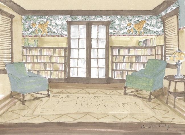
My concept sketch (above) shows how the wallpaper frieze would scale out on the focal wall above the bookshelves, and I presented it, along with a color board of textiles (below), to the college staff for their approval.
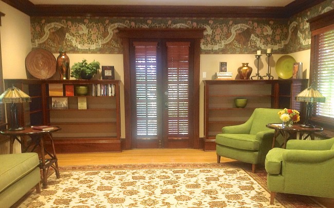
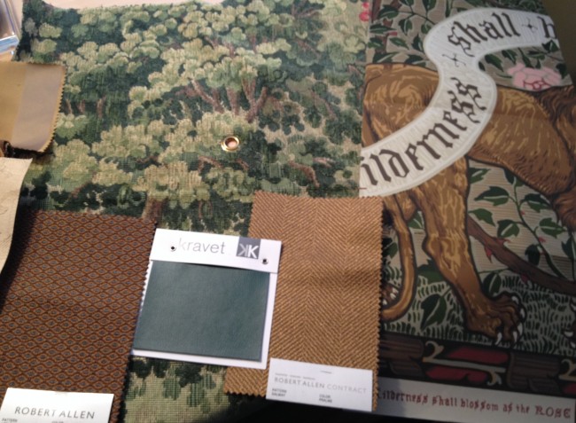 With the concept and color palette established, I also gave them a scaled out furniture plan for upholstery that would be custom built locally for the space. Once the college approved my designs, we placed the orders, and all of pieces went into production. By the end of summer, we were ready for the installation. Here is the “AFTER”shot of the living room:
What you can’t see in this shot is the large screen TV that is mounted on the wall opposite the pair of chairs. Since this photo was taken, we have also made a lot of progress with filling the bookshelves with books by Reed authors.
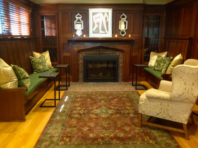
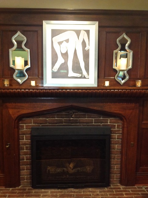
Adjacent to the living room is a charming inglenook–a fireplace with built-in bench seating on either side, paneled in dark wood. We added a rug, reupholstered the cushions, added some large toss pillows, and a number of accessories to enliven this area. Here is the inglenook BEFORE:
Here is the inglenook AFTER:
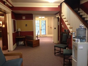
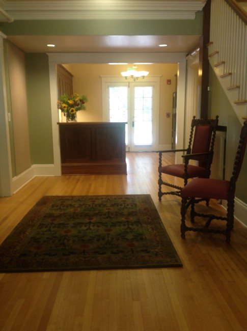
And at last comes the entry, which looked like this BEFORE:
The refinished hardwood floors make the most dramatic difference–they gleam and reflect the light. A new reception desk says “welcome,” and the area rugs and reupholstered antique chairs invite one in. Prexy feels like a home again!
My thanks to the Alumni Office staff at Reed College for being such a pleasure to work with, especially Mela Kunitz, Mike Teskey, and Todd Hesse; to Reed Archivist, Gay Walker, for providing the information and historic photos of “olde Reed”; to Jennifer Russina, AIA, from ZGF, for her design skills and for pulling with me about the lighting; to Michael Conner, wallpaper installer extraordinaire; and Jack and Luis at Design Furnishings Inc., for all of the upholstery.




There are 14 Comments to "Repurposing Prexy"
Congratulations, Kathia! You’ve done it again. Reed College must be thrilled. I absolutely love the Wallpaper Frieze. It’s stunning and so in keeping with the era.
Thanks, Jeanne!
I visit Prexy on average several times a week, and it is truly a home away from home, where I can meet in comfort with students, staff, and other alumni.
Thanks, Jim. I am fascinated with the way the students have been using the little “C” tables that I placed in the Inglenook to hold food and drink: they put their laptops on them! They also move things around a lot, which is the way it should be. Even though it’s an historic building, it’s not a museum.
This is wonderful, Kathia. Of course, the hand-blocked wallpaper is a stunner! Often I think of Arts and Crafts design as dark and brooding, but you have masterfully incorporated elements of light (floors, mirrored sconces, light wall color) to bring life and elegance to this space. No wonder all the Reed folks are so happy with the results. Makes me want to curl up there with a book. Just wonderful! Congratulations, again!
Judi Cleghorn
I love the blend of the colors with the exposed wood floors. The entire effect is cozy and inviting. The wallpaper is intriguing and certainly evocative of the period. And the wood blinds are a superb addition. Beautifully done!
The story behind this is wonderful. The “socially reforming power of art” is worth meditating upon and promoting! The frieze wallpaper is powerful. Thank goodness this redo of Prexy was in such good hands. I can’t wait to see it in person, reflect on the before and enjoy the after!
Wonderful job, Kathia! Love the green contrasting with the plethora of wood. The frieze is a stunner that pulls the whole room together. I’m so happy to hear that the bookcases are filled with books by Reed alumni! The inglenook is equally as delightful to the eye. I can see why Jim Kahan finds the environment so conducive to meetings and get togethers there now. Brava… So classy, as always.
Kathia, you’ve done it again! I can only imagine the fun/joy you had in recreating the welcoming atmosphere of the Prexy house, especially as a Reedie, yourself.
Loved the arts and crafts design. So warm and inviting with the Plexy house. You took something that seemed a tad old and fusty and made it fresh, vital, exciting and elegant. Great job!
Kathia, like Donna I love the greens, in the chairs, frieze, the fabulous cushions in the inglenook, and walls in the entry. Of course yellow and greens accented by reds are my favorites. And I love the art and sconces. What a triumph, and thank goodness you got rid of the horrid wall colors that existed in the entryway before! What were they thinking then? Love the graphic surprise of the art and sconces….
I am writing this comment from the Prexy living room itself. I have the privilege to work in this building. I speak for most of the staff here in that we often find ourselves leaving our offices and choosing to work downstairs. It is comfortable. It feels like home. Most of all it is welcoming. Thank you Kathia for such a wonderful space. It is the gem of the college.
Dear Kathia:
Thanks so much for sharing your design process for Prexy and its history. You did a great job. I think A.E. Doyle would be pleased.
The inglenook was the site for a small wedding this weekend. The warmth and coziness were perfect for the occasion. And, in our new 21st Century traditions, one of the guests was physically in New York City, but fully participated via laptop computer. He had to supply his own champagne, though.